
Korpan Tractor Visual Branding Program

The Vision
The re-branding of this major heavy equipment dealer focused on simplicity, solidity and at the same time, movement. As their competitors make heavy use of yellow in their identities, we set Korpan apart with a strong motif relying heavily on blacks. The use of embossing ‘tracks’ on the materials in harmony with the logo design gives a literal impression of activity and forward direction.

The embossed tracks are carried through to the unique business cards. To further set Korpan apart, we chose to Illustrate eight different varieties of machinery rather than heavily use photography for the corporate brand.

Each team member has eight different business card designs, each featuring a different machine type.
The Logo
An evolution of Korpans’ previous logo, the vertical bars were retained, but the logo was made more solid and simple, reflecting the sturdiness of the equipment and the reliability of the company. A 50th anniversary logo was also developed with various formats created to suit a wide range of environments.

Print Advertising
A strong and very simple visual brand was particularly effective in print advertising, where the black backgrounds and simple illustrations of machinery have come to immediately be identifiable as Korpan.

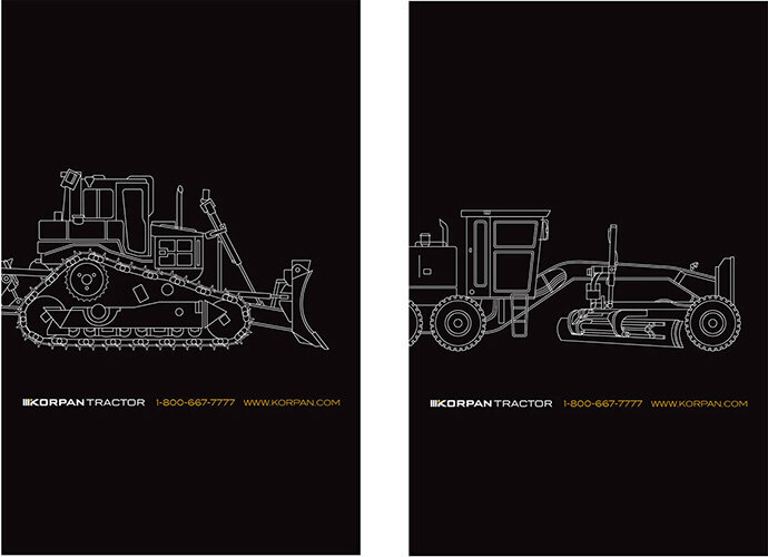
To introduce the brand, we ran teaser ads throughout publications on left-hand pages.
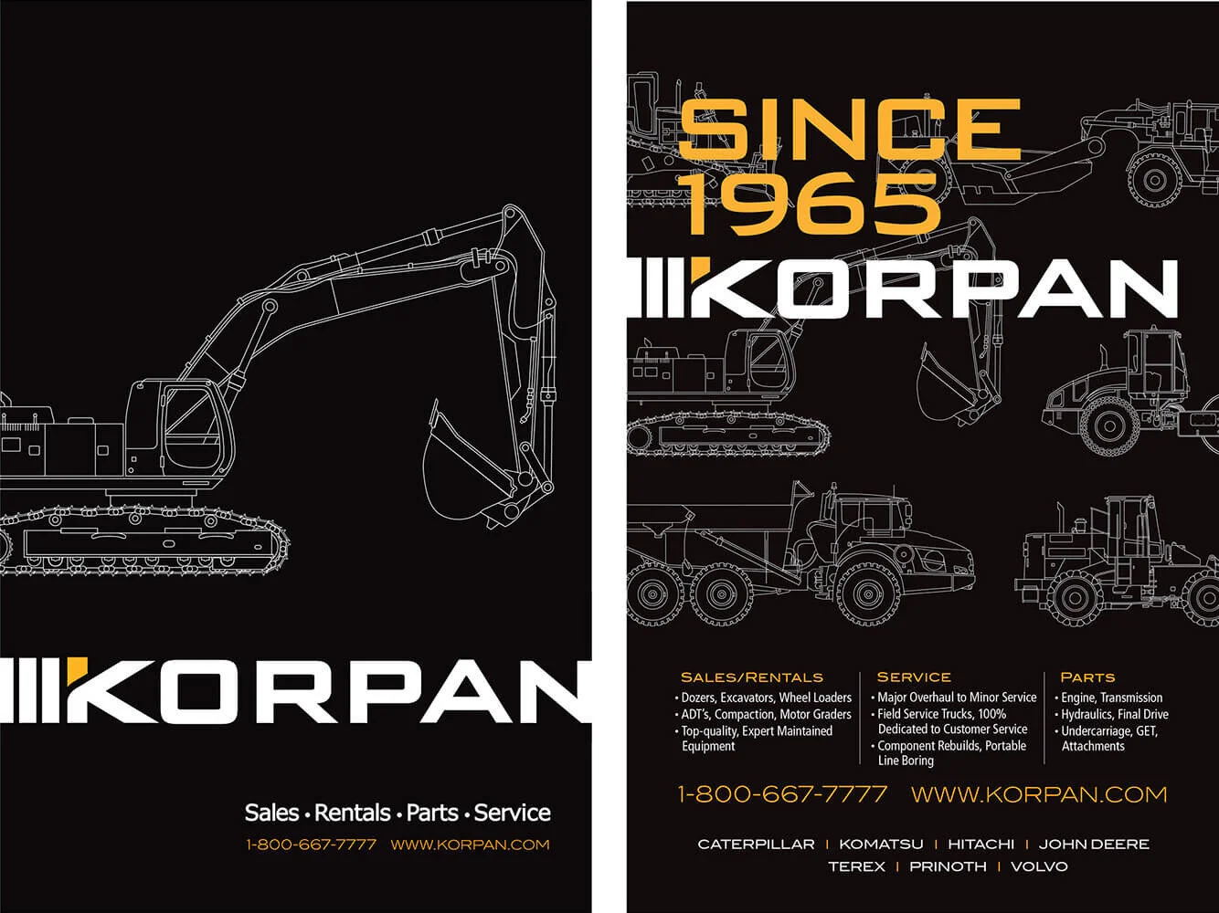
Primary imaging ads (left) run on back covers and targeted ads (right), which present strategic content and messaging, run inside pages.
