
Kindrachuk Agrey Architecture
Branding Program
Kindrachuk Agrey Architecture is a premiere full service design, planning and architectural consulting firm, and a leader in innovative and sustainable building design. In 2019, the firm achieved LEED Platinum status - the first of its kind in Saskatchewan.

A reflection of the brands overall approach, the simple form of the logo in concert with tasteful application results in a subtle yet powerful impression.
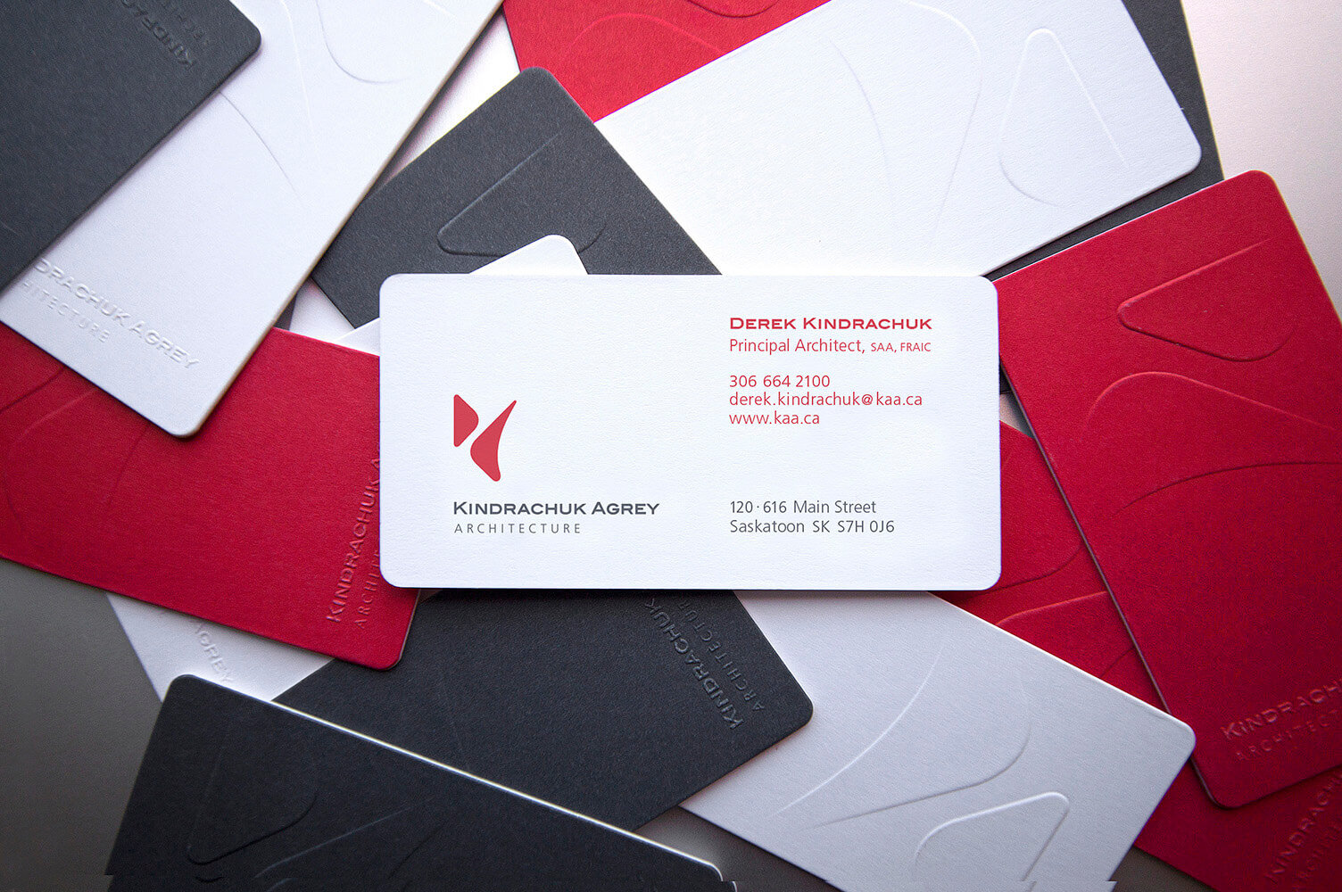
The business cards feature a premium multi-level emboss using two separate layers of paper laminated to form each card. Each staff member’s card collection features all three colors on the backs: Red, white and grey.
The Logo
As the primary visual element representing the firm in years to come, this new logo was developed to represent Kindrachuk Agrey Architecture’s collective principles, spirit and culture. The firms’ reputation for high quality of design and experience can be seen in the logo’s elegance, confidence and purposeful simplicity.

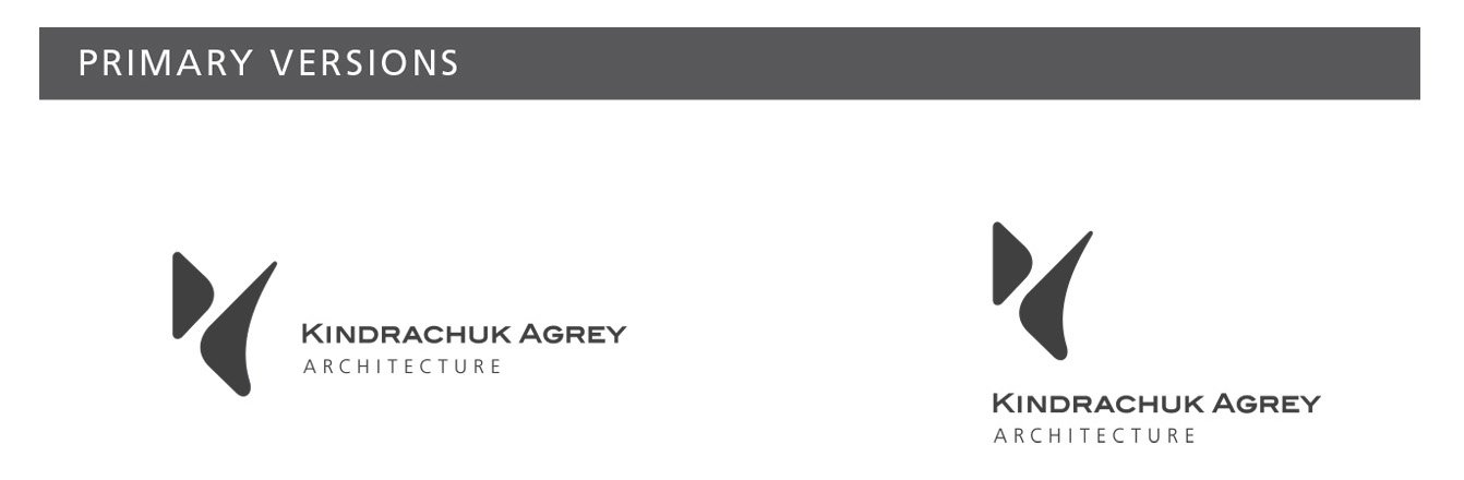

A commitment to sustainability, community and relationships are reflected in a holistic design who’s elements, while physically separated and unique from each other, spatially collaborate to achieve something fresh and new; something far more than the sum of their parts.
With purposeful disregard for beaten path and well-worn convention, the logo embodies design innovation, creativity, and passion through it’s boldly unique, yet practical approach. Movement and energy are heightened through the eye’s natural journey through the white space and the effortless choreography between the two shapes.
The Applied Brand
The application of the brand was kept very minimal, clean and powerful through use of solid colors, visual economy and very high-end production.

Entrance Graphics
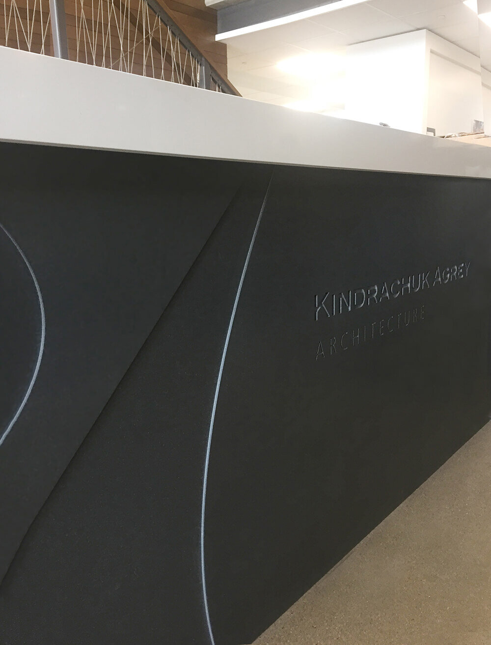
Front desk logo application - routered granite.

I.D. tags

Site Helmet Graphics
Ad Shell and Site Signs
A very public face of the firm is print ads and site signs. These were kept very simple and in the case of client-focused ads, the logo gave way to the external messaging by bleeding it beyond the border, even though it remains equally or more prominent visually.


Branding Standards Guidelines
Proper management of the many elements of a brand not only results in a cohesive brand perception, but also enables staff to make use of the materials efficiently. This premium branding standards manual is a comprehensive guide to the the brand philosophy, key elements and their proper usage.

Premium branding standards manual and sample pages


Kindrachuk Agrey Branding Program was presented with Best of Show, Judges Choice and Best of Category at the 2017 Elevator’s Design Conference and Awards Gala.
